
Essentrolyte Brand Identity and Label
An old colleague of mine started this new supplement company and their first product was a nutraceutical hydration alternative to sports drinks. I was enlisted for the branding and packaging.
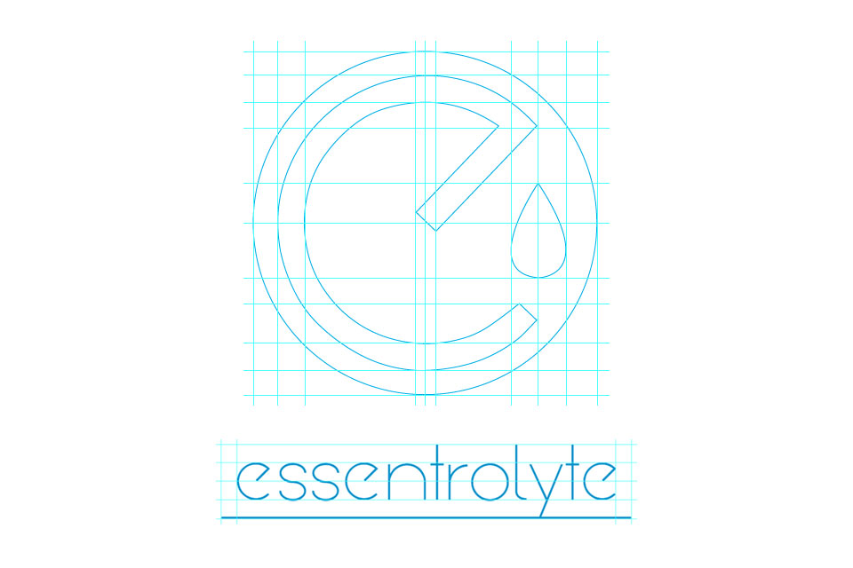
We made the E the focal point emphasizing hydration with the droplet.
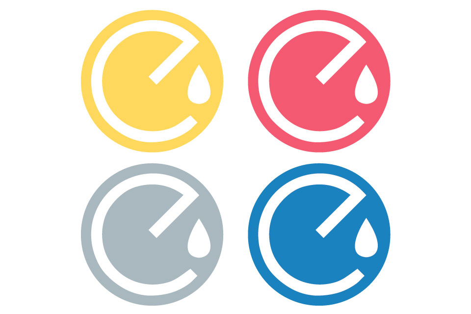
They were not sure the color or flavor initially, so we went with a blue to symbolize water and hydration.
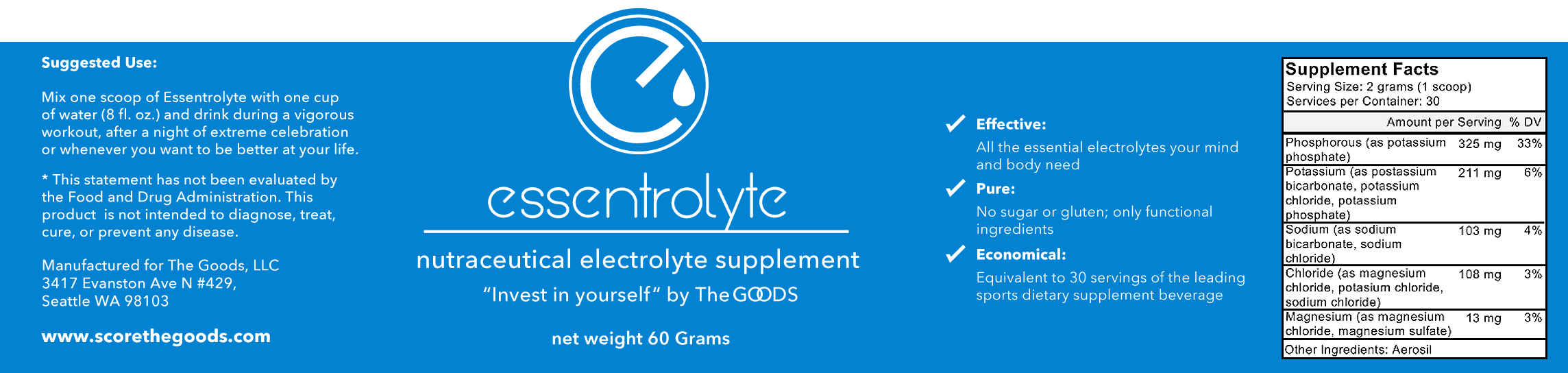
Simple and clean label, the E bumping out for brand recognition.
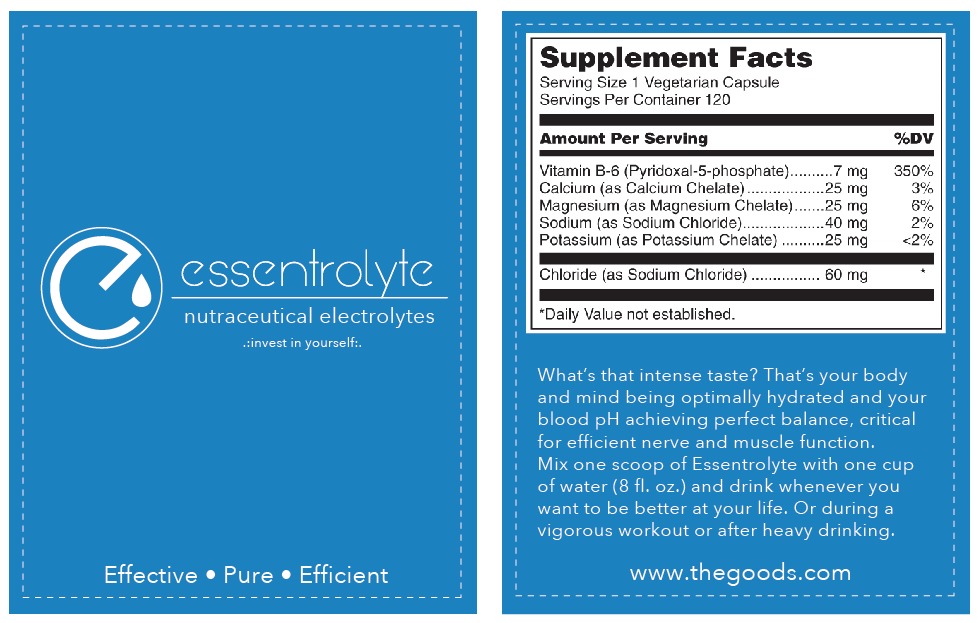
Single serving packet design.
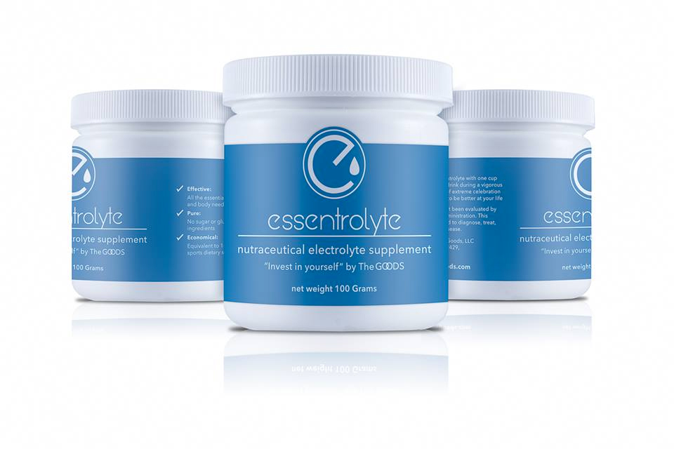
The final container rendering.
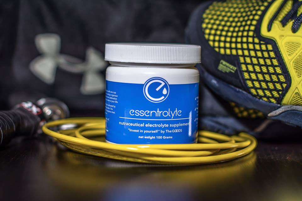
Marketing collateral, "Invest in yourself".